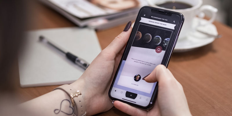
3 Mobile Web Design Trends Emerging in 2018
In 2016, mobile use moved ahead of desktop browsing and it has increased with every passing year. Additionally, Google has begun rolling out it’s “Mobile First Index” which ranks each website based on its mobile experience, instead of the desktop experience. Thus, it should come as no surprise then that the web design trends in 2018 are geared towards creating a better experience for mobile users. In this post we will outline three emerging trends in web design and how they help improve customer experiences, especially for mobile users.

Increasing Negative Space
Space is valuable real estate when it comes to mobile screens. There is little room for gimmicky, eye-catching components that offer little in the way of driving value and conversions. The overall theme of 2018 is encourage engagement, but without unnecessary distractions. By using negative space and focusing on adding only those components that enact engagement, web designers highlight the critical areas of a page, while leaving enough negative space to keep the page looking clean and minimalist.
More Expression Through Typography
Text-based design elements work very well in mobile web design. Allowing typography to present interesting design features rather than images means a user can still experience a page that is visually appealing without incurring a drastic hit in performance or load time with high resolution images and videos. Typography plays a critical role in communicating information, so web designers fulfill dual roles when they add stylish, yet meaningful text. Of course, images and videos will still be used on the web due to their inherit value for communication, but more emphasis is being placed on a reasonable balance of rich content due to mobile network speeds and data limits.
Increasing Use of Cinemagraphs
Video clips have their purpose but they also take time to load and static images are a bit bland. In between the two, are cinemagraphs. The purpose of adding a cinemagraph is not to provide any type of gimmicky flair to impress users. Rather a designer will make use of cinemagraphs to add value to pages. For example, rather than simply providing a flat image of a product, a web designer can add a cinemagraph with a 360-degree view, thereby providing a real benefit to potential customers as they can better experience and examine the product.
As users continue to use mobile devices for accessing websites, we anticipate there will continue to be an expanding emphasis on “mobile first” design elements. If you’re wondering how well your website looks on mobile devices, contact us for an evaluation.
About the author
For over a decade, Igniting Business has established itself as a comprehensive resource for small businesses looking to succeed and grow to the next level. Our team works with small businesses all over the nation from our headquarters in Lee’s Summit, MO (Kansas City area). Our services include the full spectrum of web design, search engine optimization (SEO), and digital marketing.
Igniting Business’ team consists of SEO, web design, and digital marketing experts. Some of our certifications and partnerships include:
Igniting Business’ team consists of SEO, web design, and digital marketing experts. Some of our certifications and partnerships include:
- Google Partner
- Google Ads Certified
- Shopify Partner
- MailChimp Experts
- Joomla Service Provider
- YOOtheme Pro Experts
Additionally, our staff has been featured on news outlets including Fox Business, CNBC Universal, Intuit Small Business, Yahoo News, The Kansas City Star, and more.
For more web design, marketing, and SEO tools and tips from Igniting Business, check out our resources page.
To learn more about our company and our leadership, view our full company profile.